Client
Formentory
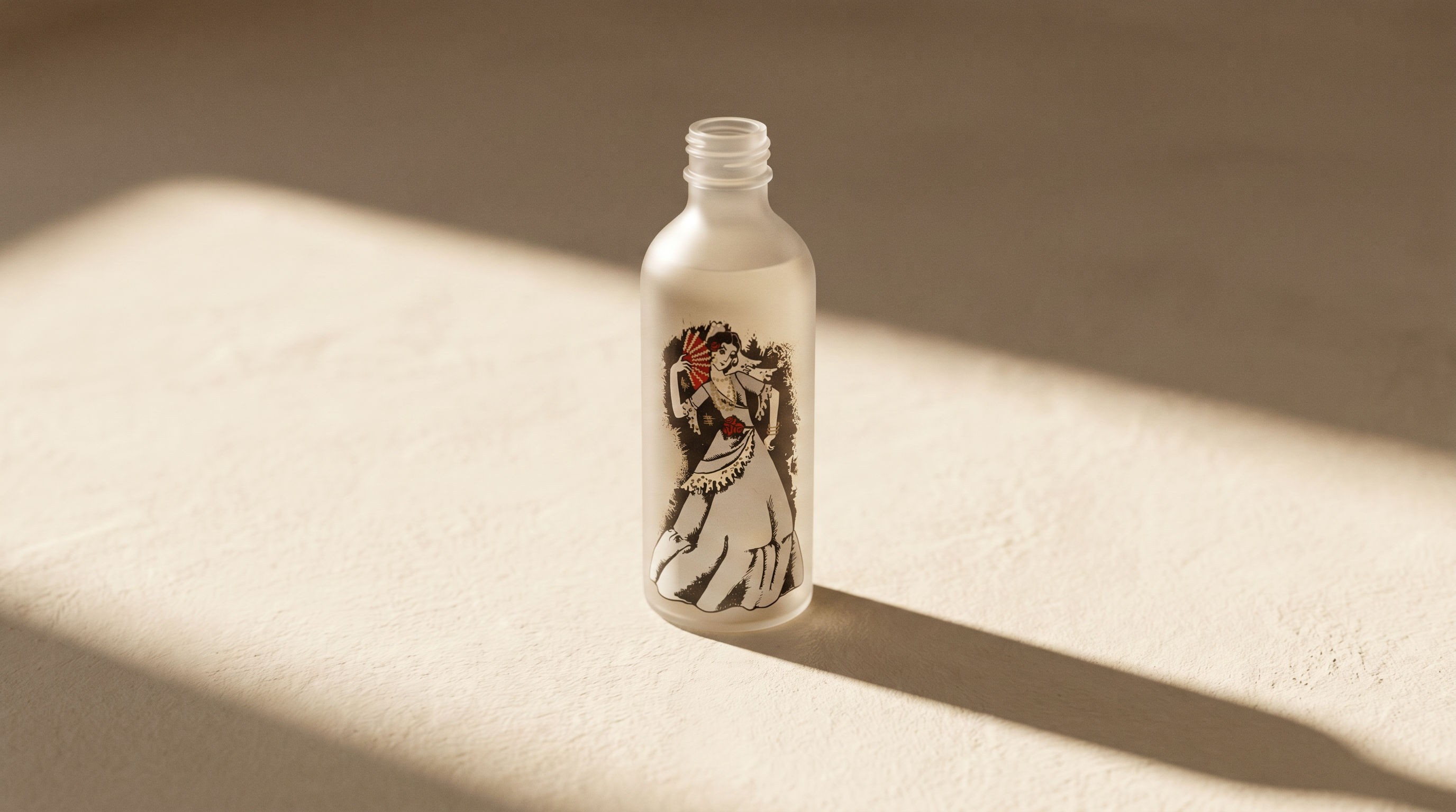
Formentory — a personal-care maison.
■Brief — A heritage-feel identity and packaging for a new cosmetics line.
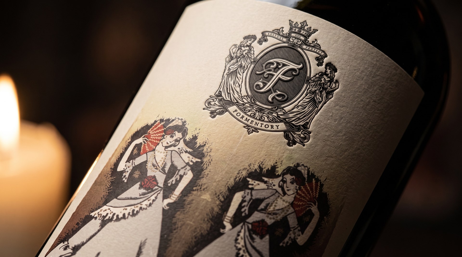
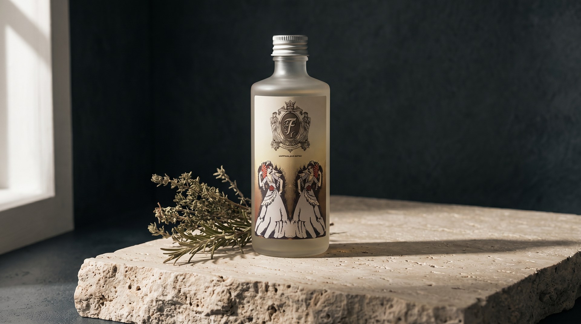
Formentory needed to feel like a house with history — refined enough for a premium shelf, warm enough to love. We built the identity around a heraldic emblem and an ornate wordmark, paired with an editorial, painterly world.
From the identity we designed a complete packaging system — shampoo, balsam, body and hand cream — with consistent label architecture, typography and finish across every format and size.
Outcome — a fully realised brand — identity, guidelines and a production-ready packaging system — that reads as an established maison, not a launch.